9 tips to optimize your restaurant menu and increase online orders
Looks matter. A cluttered interface and tacky images are enough to make a customer leave your restaurant’s website and look for something more appetizing elsewhere. You must have done this too, being a customer yourself.
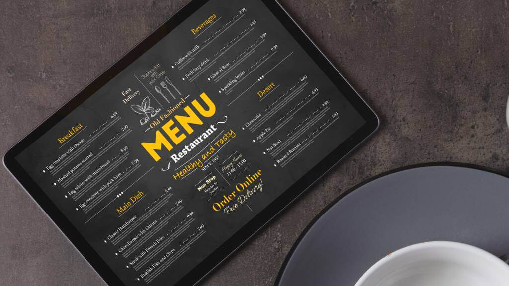
Will your customers stay (and order!) or leave, then? The way your restaurant menu is presented can sway them in either direction. Sure enough,you don’t want customers to close your menu in frustration, so here are 9 tips on how to create and structure your restaurant menu to increase online orders.
1. Be descriptive
People know what a chicken primavera is. What they don’t know is that your sauce is homemade, your vegetables are organic, and that the pita bread that comes with it is crunchy and warm. In other words, describe these unique characteristics with carefully selected words that will make customers vividly imagine the texture, taste, and smell of your food. The competition is fierce, so don’t be humble. Anything that highlights the quality or character of your dishes, like locally produced ingredients or cooking in a stone oven, should be mentioned in the dish description.
2. Entice with an image
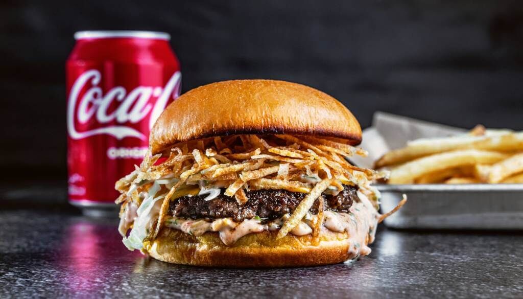
Your customers are browsing your menu because they’re hungry and ready to order. You don’t need to do much convincing, just give them something irresistible so that they hit the order button -- with an image! You can take professional-level pictures with your smartphone, but don’t use many filters except to improve the lighting. You want your food to look perfect but real.
3. Pick what stays and what goes
There are two key reasons why you should choose which dishes are available for delivery and which not. One, a lengthy restaurant menu can confuse and even frustrate customers. So to keep the menu short, offer customers a nice but not extensive variety of choices. And two, some dishes are not suitable for delivery. For example, dishes that can’t be prepared beforehand will slow down your delivery times. Also, dishes that don’t travel well will arrive in poor condition, looking sloppy, and might result in a negative review and a disgruntled customer.
4. Create several categories
Another way to avoid confusing your customers and help them navigate the menu easily is to break it down into different categories by type of dish or main ingredient. The latter will also help customers who don’t know what they’re in the mood for, to make up their minds faster. If your chef has created signature dishes, display those on the top of the menu.
5. Highlight special dishes and tastes
If you have any special dishes in your menu, like vegan, vegetarian, low-calorie, high-protein, spicy, etc., add a discreet icon beside the dish for the customers to see. Or, if it makes more sense, instead of using icons beside every dish, create categories. A restaurant that offers salads, for example, can create different categories to distinguish between low-calorie, high-protein, and no-meat salads.
6. Keep it elegant
Avoid cluttering your menu with indications like top-selling, new, and best deal. If you offer several combo deals, it’s best if you create a separate category with all the options. Keep icons and exclamation marks to a minimum, otherwise, your menu will look tacky and give the impression that you’re trying too hard to hold on to the customer, like a pushy salesperson.
Also in the spirit of keeping your menu elegant, make sure you have someone proofread your menu to eliminate spelling mistakes. Although one spelling mistake is unlikely to cost you a customer, or even to be spotted, it does look unprofessional.
7. Offer customization options
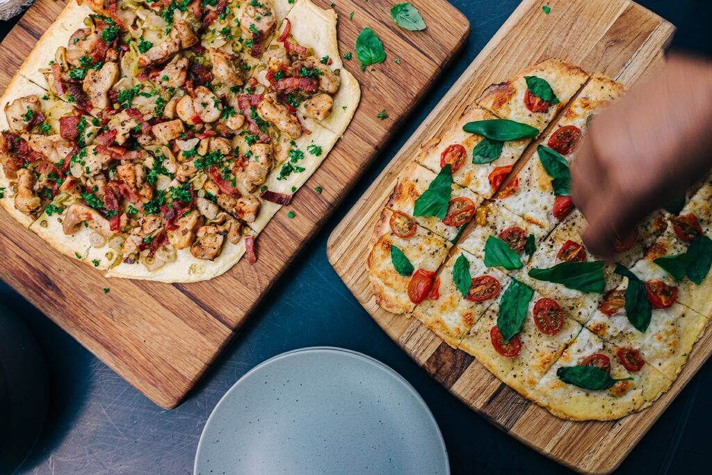
Customers have allergies, as well as likes and dislikes. Unless adding or leaving out an ingredient will ruin the taste balance of a recipe, allow your customers to bring the plate closer to their taste so that they’re left satisfied and order again. For certain types of dishes, like pizza and salads, it’s common practice and a given for customers to create their own plate. You can turn this into a contest and reward the best customer-generated recipe by adding it to your menu.
8. Suggest add-ons
Add-ons are how you can increase the average order value while improving the dining experience of your customers. Beverages, sauces, and side dishes that go well with a main dish will bring out the flavor of the food and turn a quick bite into a satisfying meal.
9. Be consistent with your brand image
What is your restaurant known for? Do you offer a healthy fast food alternative for younger consumers? Is your cuisine traditional with a twist? Do you own a cozy, traditional Italian restaurant that believes the family should eat together every night? Whatever you stand for, and whatever you want your restaurant to inspire in your customers, must be evident in your menu. When customers can identify with your brand, they’re more likely to stick around. Therefore, ensure your photos, fonts, and the overall design align with your beliefs and image.
Food for thought
Whoever says they don’t judge a book by its cover is lying. As customers are browsing through your restaurant menu, the way your menu is laid out will drive their decision to order or pass.
A mobile app for restaurants facilitates online ordering, increases orders, and builds loyalty. Read our post Building a mobile app for your restaurant? Make sure you include these 9 features! so that your mobile app becomes a hit.


